1.2.1. GRASSHOPPER OBJECT TYPES
Grasshopper consists of two primary types of user objects: parameters andcomponents. Parameters store data, whereas components perform actions that resultin data. The most basic way to understand Grasshopper is to remember that we willuse data to define the inputs of actions (which will result in new data that we cancontinue to use).
1.2.1.1. PARAMETERS
Parameters store the data - numbers, colors, geometry, and more - that we send through the graph in our definition. Parameters are container objects which are usually shown as small rectangular boxes with a single input and single output. We also know that these are parameters because of the shape of their icon. All parameter objects have a hexagonal border around their icon.
Geometry parameters can reference geometry from Rhino, or inherit geometry from other components. The point and curve objects are both geometry parameters.

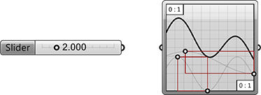
Input parameters are dynamic interface objects that allow you to interact with your definition. The number slider and the graph mapper are both input parameters.

1.2.1.2. COMPONENTS
Components perform actions based on the inputs they receive. There are manytypes of components for different tasks.

- The multiplication component is an operator that calculates the product of twonumbers.
- The Divide component operates on geometry, dividing a curve into equal segments.
- The Circle CNR component constructs a circle geometry from input data; a center point, normal vector, and radius.
- The Loft component constructs a surface by lofting curves.
1.2.1.3. OBJECT COLORS
We can glean some information about the state of each object based on their color. Let’s take a look at Grasshopper’s default color coding system.
A parameter which contains neither warnings nor errors is shown in light gray. This color object indicates that everything is working properly with this parameter.
A parameter which contains warnings is displayed as an orange box. Any object which fails to collect data is considered suspect in a Grasshopper definition since it is not contributing to the solution.. Therefore, all parameters (when freshly added) are orange, to indicate they do not contain any data and have thus no functional effect on the outcome of the solution. By default, parameters and components that are orange also have a small balloon at the upper right hand corner of the object. If you hover your mouse over this balloon, it will reveal information about why the component is giving you a warning. Once a parameter inherits or defines data, it will become grey and the baloon will disappear.

A component is always a more involved object, since we have to understand and then coordinate what its inputs and outputs are. Like parameters, a component with warnings is displayed as orange. Remember, warnings aren’t necessarily bad, it usually just means that Grasshopper is alerting you to a potential problem in your definition.

A component which contains neither warnings nor errors is shown in light gray.
A component whose preview has been disabled is shown in a slightly darker gray. There are two ways to disable a component’s preview. First, simply right-click on the component and toggle the preview button. To disable the preview for multiple components at the same time, first select the desired components and then toggle the disable preview icon (blindfolded man) by right clicking anywhere on the canvas.
A component that has been disabled is shown in a dull gray. To disable a component you may right-click on the component and toggle the disable button, or you may select the desired components, right click anywhere on the canvas and select Disable. Disabled components stop sending data to downstream components.
A component which has been selected will be shown in a light green color. If the selected component has generated some geometry within the Rhino scene, this will also turn green to give you some visual feedback.
A component which contains at least 1 error is displayed in red. The error can come either from the component itself or from one of its inputs or outputs.

- A parameter with no warnings or erros
- A parameter with warnings
- A component with warnings
- A component with no warnings or errors
- A component with preview disabled
- A component that has been disabled
- A selected component
- A component with an error